The acronym of Jorge Ortega Afonso (JOA) is at the essence of this signature project, made to celebrate Aldeia da Parada, where he was born, by preserving and enhancing the authenticity of his origins and its people. It is the story of a family vineyard’s trying to blend tradition and innovation to master a unique wine made.

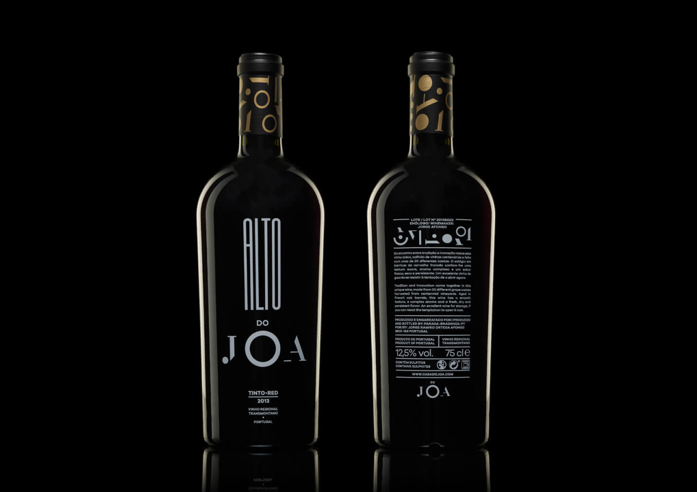
JOA is the visual epicentre of the entire identity system. It is a wordmark of strong charisma that is uniquely drawn between the trace and its absence for a unique and delicately sophisticated result. The neo-classical lettering of the extremes contrasts with the simplistic modernity of the “O” that embodies the central core of its identity.
This is a core visual reference around which the whole brand visual narrative gravitates. Throughout JOA’s identity, the company will endorse its products and services under the brand “Casa do Joa.”

Communication Contents
Production Manager
Communication Design
Packaging Design